
This week, my focus was on creating an Excel spreadsheet again but this time was more of metaphors and keywords. The idea was to explore how different images and metaphors connected to my design work, and honestly, it ended up being more reflective than I thought it would be. I used the spreadsheet to organise 3 photos that I felt related to each of my chosen keywords, and then I broke each one down into different sections: description, symbolism, context, personal interpretation, and application to design.
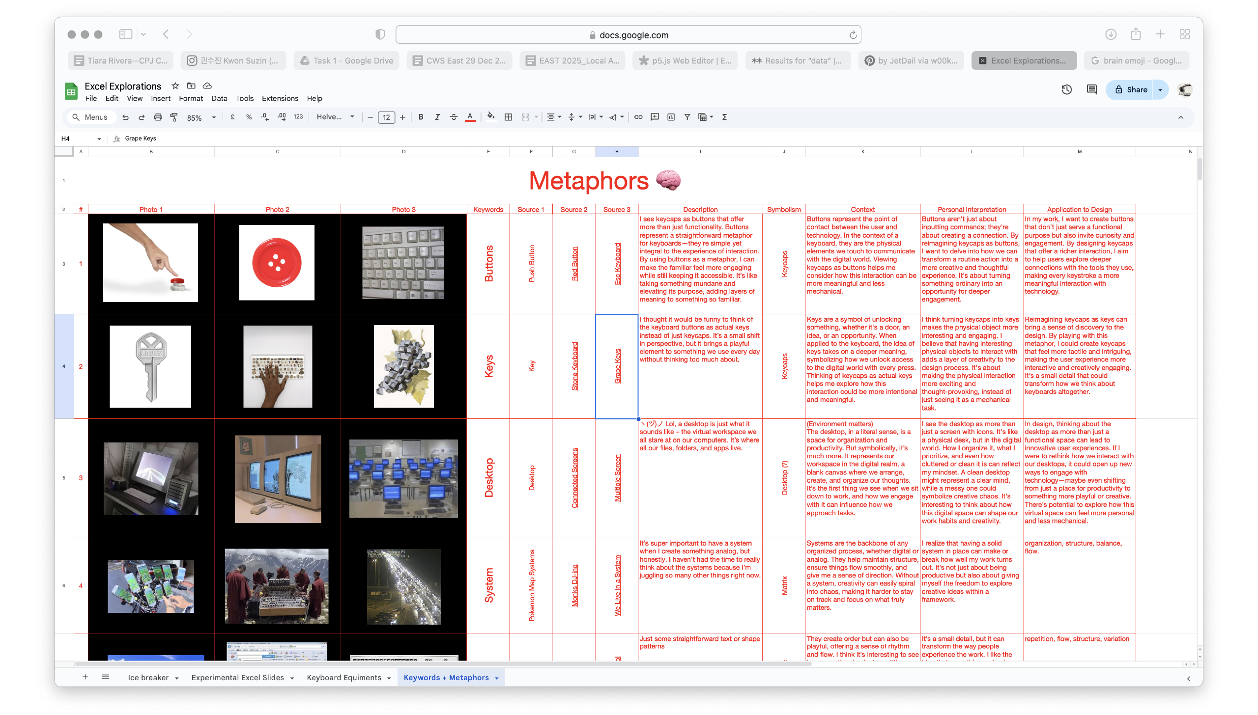
At first, I wasn’t sure how this task would turn out because spreadsheets usually feel so rigid, but I quickly realised how useful they can be in giving structure to abstract ideas. It allowed me to clearly see the connections between the images and my thoughts, almost like mapping out a visual language. Each photo was chosen carefully to reflect something about my keywords, but what surprised me was how much the symbolism and personal interpretation sections made me think deeper. I wasn’t just looking at the images; I was analysing why they felt important and how they could influence my design work.
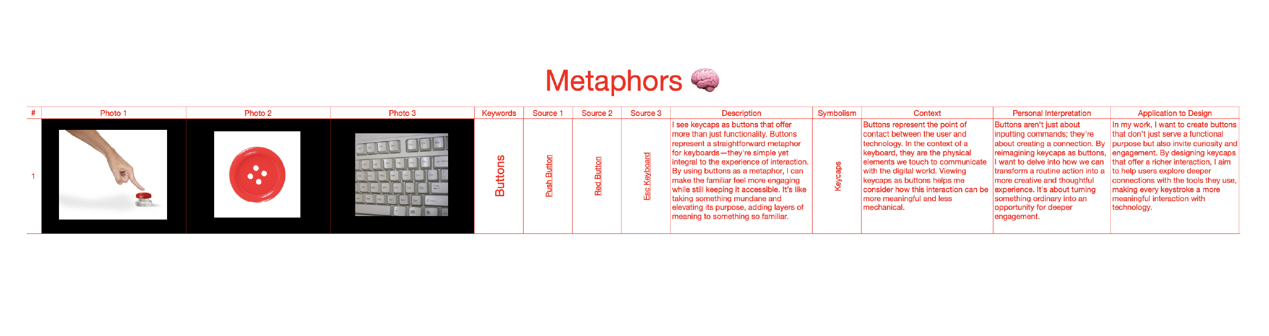
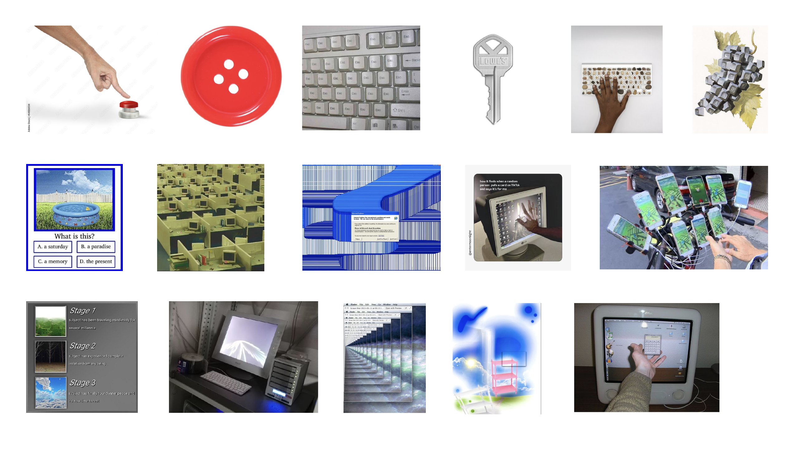
For example, one of my keywords was “Button,” and the images I chose weren’t just random buttons but ones that seemed to have character or evoke a specific feeling. In the description, I focused on how keycaps resemble buttons in both form and function, while in the symbolism section, I connected the idea of buttons to control and interaction. It made me realise that a simple, everyday object like a button could represent much more than just a piece of plastic—it could symbolise how we engage with technology. This reflection pushed me to think about how I could bring this concept into my design work, making buttons (or keycaps) more than just functional elements but also something that adds a layer of interaction and meaning.
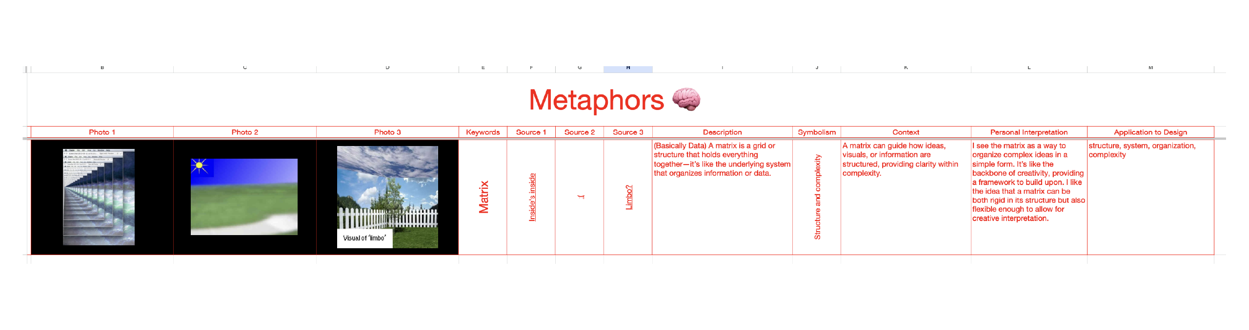
Another keyword was “Matrix,” which, to me, symbolises structure and complexity. The photos I selected for this were grids or patterns that visually represented how systems hold things together. In the context section, I reflected on how a matrix organises different elements into a cohesive structure, whether it’s text, data, or even visuals. This made me think about how I could apply the concept of a matrix to my own designs—creating something that’s structured but still allows for creativity. The personal interpretation section really helped me see the flexibility within the rigid system of a matrix, and how it could serve as a foundation for more dynamic design work. I’m starting to think of the matrix not just as a tool for organising but as a framework that can encourage exploration within its boundaries.
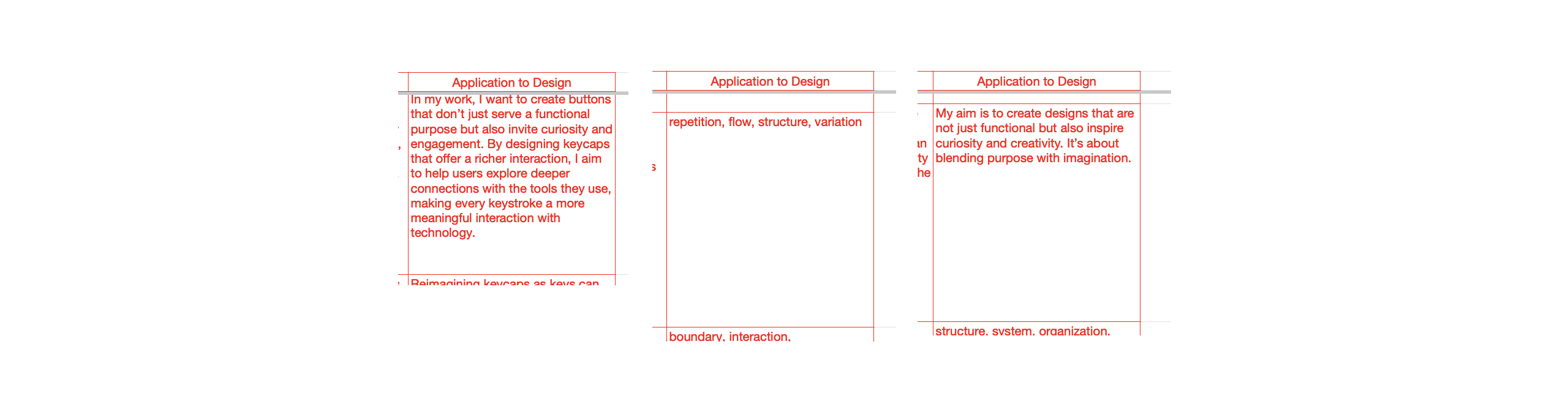
The spreadsheet also had a section for “Application to Design,” which was where I took all these abstract ideas and figured out how to use them practically. This section helped ground the more creative, free-flowing thoughts into something actionable. It pushed me to think about how these ideas could actually influence my design process, whether it’s experimenting with the physical form of buttons or using the concept of a matrix to organise content in a more engaging way.
At first, I thought using a spreadsheet would feel a bit too rigid, but it ended up being super helpful in guiding my ideas. It gave me a clear way to map out how these abstract concepts, like “buttons” or “matrix,” could become real, practical design elements. This whole process was a nice mix of reflection and creativity, and I feel like it’s going to have a real impact on my future work. I decided to do this test because I realized that my previous tasks weren’t connecting well. This experiment felt like a way to bridge that gap. It’s helping me move toward my next focus: exploring text patterns, which will eventually lead to my analog explorations. It feels like a natural progression, and I’m hoping that this step will bring more cohesion to my project.